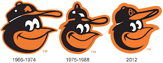
In this segment, we will discuss comparisons between throwback logos and uniforms, and 'fu-backs', or the throwbacks revived in a contemporary sense. The suffix 'fu' stands for future, if you don't know. Our next feature focuses on the Baltimore Orioles.
Logo
The Orioles revived the iconic cartoon bird logo in late 2011. This logo is closely identified with the team through three World Series triumphs in 1966, 1970 and 1983. The modern version is as detailed as ever, featuring the alternate O's logo on its cap and a sleeker look. The new logo replaced the 'ornithologically correct' Oriole logo which they used from 1989-2011.
Uniforms
 |
| The new orange jerseys and the old orange jerseys, side by side. |
While the cartoon bird was the only change, in the uniform department, they revived the orange jersey for Saturday home games. The Orioles have used an orange alternate jersey on several occasions throughout their history. From 1971-72, they wore a full-bodied orange uniform. In 1975, they brought back the orange jersey, but not the knickers, and used them from 1975-92, with the exceptions of the 1983, 1985 and 1986 seasons. From there, they switched to black alternates starting with the 1993 season, and have used them since.
Comparing the previous orange jerseys to the current ones, on the new jerseys, the wordmark 'Orioles' appears with better calligraphy than it did in the previous incarnations, while the Maryland flag badge appears on the left sleeves. Orioles fans have immediately accepted the new duds just as the return of the cartoon bird was well-received.
 |
| The current home jerseys, as seen on Matt Wieters, have combined the classic 70s look with the 90s typeface. |
And if you were wondering, the current Orioles jerseys (home whites, road greys, black alternates) remained the same from previous years. The home set, in particular, was a mix of the old and the new, with a predominantly orange lettering inspired from the 1970s and 1980s set, and the 's' tail extending to the bottom of the word 'Orioles' having stayed virtually the same since the 1990s. They, along with the orange alternates, are paired with the two-tone headwear featuring the aforementioned cartoon bird and white in front.
The road greys, in use since 2009, feature 'Baltimore' on the script, their first instance of the city name used on the uniforms. Other than that, the lettering colors have stayed the same since 1995. The road headwear is black all over, again with the cartoon bird.
The black jerseys were introduced in 1993, and with the exception of white trim in the 1990s and the use of the alternate 'O's' cap since 2005, have also remained unchanged. The black jerseys are currently used on Friday games, home or road. However, they never had an 'O's' batting helmet, instead using their cartoon bird helmets.
Bringing back the cartoon bird makes more sense, isn't it? The Orioles history is closely identified with this classic look, and fans love it. The uniforms are a mix of classic and modern styles, and the orange alternates brought back a sense of nostalgia and attitude among old and new Orioles fans. If they win the World Series this year, then this look may top all 'best uniform' lists this year. The winner: Tied

No comments:
Post a Comment